Animation Project

Initial Ideas:

Basically I have chosen the idea of evolution to base my animation on.

I have been inspired by the game Spore. In the game you start as a small cell and begin to evolve yourself by eating other cells and eventually you grow enough to because a real creature.

My animation will basically be a movie of this transformation with a few interactive elements mixed in. The user will be able to choose path the cell takes whilst evolving. I would also like to make some interactive background elements to the animation.

Here is the evolution of the cell:

Below I have drawn some very basic story boards as to how the animation will go.

Ok. It’s changed again.

I still like the grungy theme…but…

…the background was too busy and it didn’t look great. Also there was no real colour scheme to stick to. Therefore, I have kept the textured style background but made it much more subtle. (It’s now just a paper texture that I have removed the colour from and edited so that it tiles.)

Also, I have kept the sort of grunge them with paint brush effects at the top of my page. These are three different colours and they create my colour scheme.

Have a look

A logo that fits.

I wanted my logo to be a B. So I made a logo thats a B. Simple.

I stuck to the grunge kind of theme with a paint splatter style logo that can be changed to any colour or style really.


Changed my mind … for the first time.

Basically over the past few days I have been looking at some more japanese art and have tried to create some myself. It’s hard!

To digitally create a koi fish that actually looks decent takes some real effort. I don’t want it to seem like I’m giving up because it’s too complicated but I want my site to look really good, not just ok. I feel I will make a better looking site if I change my idea.

So. I was left thinking.

Most the photoshop work I have done before has had a textured under-layer and then other levels are built on top of that. I usually use a grungy style texture or a paper texture which I get from this amazing site –> http://lostandtaken.com

I was looking on there and found a really cool texture that I like and am now going to use it as the background of my website.

I have started changing it up already. Also I’m going to use an interactive menu (seeing as i’m an interactive media student). At the moment the menu has the standard little logo things on it but I will create some new ones on photoshop to replace those to stick with the theme of my site.

Here’s what it looks like right now:

At the moment it looks all centered and too uniform. I don’t want it to be like this. If its possible I want the slide show to be going on in the back ground and to then have parts of it creeping through the page. I will do a quick photoshop to show you what I mean. 2 secs ….


…back.

This is what I mean:

Basically, the slide show will seem to fade into the background and almost look like its creeping through it.

Developing Ideas

Theme:

I want to create a theme throughout my website. I really like Japanese art at the moment, especially koi fish and waves, and I would like to include some in my website but with a modern twist.

I really like websites that look really clean and have quite a lot of space free. I want my website to look like that but also include lots of art.

These are a few images that I like:

I have a basic idea for a logo:

However, I want to create a japanese style one instead of the paint smudge effects to continue the theme of the website and I want it to look much cleaner and smooth.

Designing my portfolio website: First Steps

As part of my course I have been asked to create a portfolio website so …lets begin.

Initial ideas for my site and stuff to include:

  • I want the home page to be clean and crisp and the other pages to contain most the content
  • I want there to be a slide show of my previous work incorporated into the home page.
  • I want there to be a clear colour scheme
  • I want the navigation to be right at the very top of every page in a menu that always looks the same
  • I want to stick to the same theme of background images throughout the site but for them to change slightly

A few websites that really inspire me:

http://OwaikeO.com

http://unowhy.com/

http://www.serialcut.com/

http://www.tearoundapp.com/

So now to start drawing a wireframe for my home page….

……………………………………………………………………………………………………………………………………………………………………

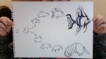
Ok so now I have drawn a very basic layout for my home page.

……………………………………………………………………………………………………………………………………………………………………

Now I have my basic idea I will start using photoshop to make it look clean and presentable.

……………………………………………………………………………………………………………………………………………………………………

I have decided on this basic layout but I think it is a bit plain and boring.

I want to add a theme to it which will be present throughout the website. I really like http://owaikeo.com and I would like to make my page look as great as that.

Obviously I can’t make it look like his because he is an amazing illustrator and draws all his images himself.

However, I do like the concept of making the page look almost 3D and as if it is folded and covered in objects.

……………………………………………………………………………………………………………………………………………………………………

What I’ve Done So Far:

Well… I have made my general layout on HTML5 and have made it look a bit snazzy with CSS but it is just very basic right now. Only block colour and simple fonts.

I have also started teaching myself some basic jquery, thanks to tutorials,and have been able to put a slideshow on my page that actually looks awesome!

Here is what it looks like so far…

(That picture is actually a slide show)

Next I need to fill in all the information that I will include on the home page and all the text.

Then I will start creating images in photoshop to add in as the background and as random objects similar to  the owaikeo example.